- PacketVis detects changes in how your prefixes are reached from the Internet through upstream providers.
- Alerts fire when an upstream gains or loses a significant share of your prefix visibility.
- You can observe the before/after visibility of the impacted upstreams.
- Drill into a per-prefix table to see which prefixes pass through which upstreams.
- The alert is automatically resolved once upstream visibility returns to normal.
In multi-homed networks, autonomous systems connect to multiple upstream providers for redundancy, performance, and cost optimization. Monitoring how much each upstream contributes to your overall visibility is critical.
Correctly identifying AS relationships is not easy. We’ve improved how PacketVis identifies and tracks upstream relationships. The new approach combines BGP topology analysis with statistical analysis of routing announcements to detect which ASes serve as your upstream providers. This allows us to introduce a new alert type, named Upstream Visibility, which tracks how much each upstream contributes to the visibility of your prefixes. The same calculation method will soon be applied to improve the automatic upstream/peer tracking we use to keep your monitoring configuration up to date.
Upstream Visibility Events
The new upstream visibility events track three metrics to show how your network is reached from the Internet: Visibility Score, Reachability Score, and Prefixes Percentage, respectively reporting how much each upstream contributes to your prefix visibility, your reachability through more-specific prefixes, and the share of announced prefixes visible through each provider.
A sudden variation of these metrics may indicate a leak, an error during traffic engineering, or a problem with an upstream provider.
Visibility Score
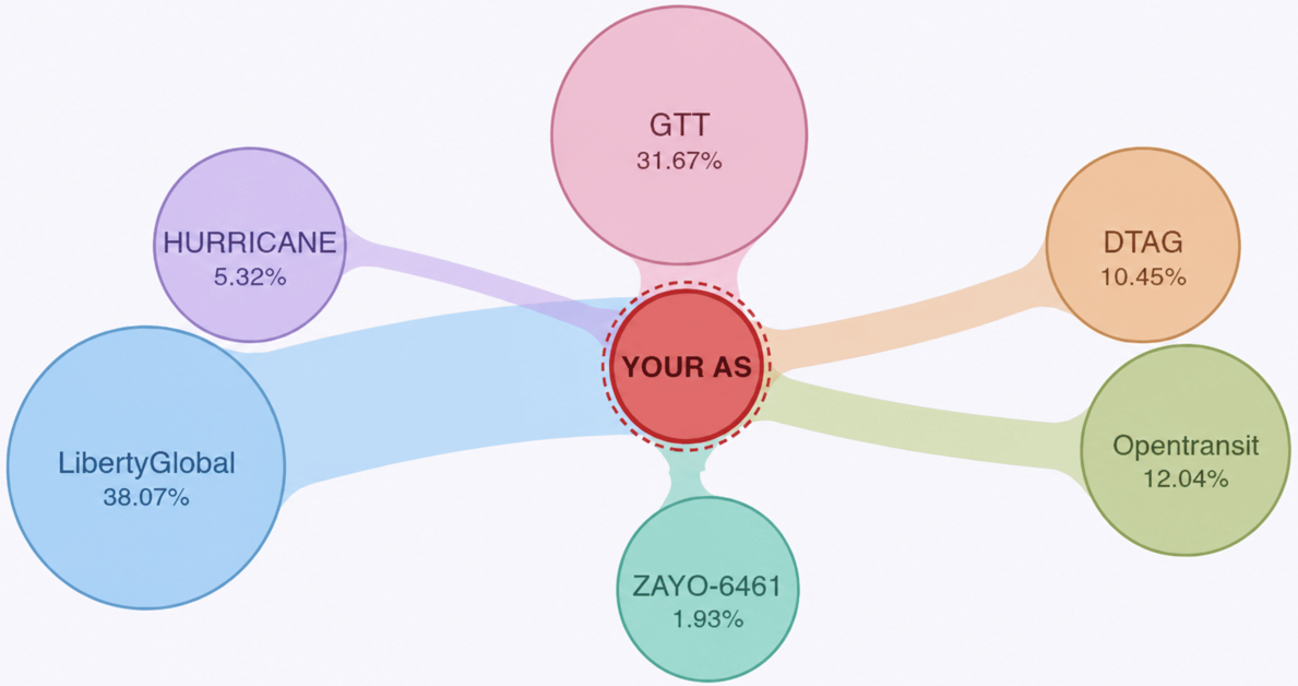
The Visibility Score metric measures the overall contribution of each upstream AS to the visibility of your prefixes. It is calculated as the percentage of AS paths (best-path) that pass through each upstream provider to reach the BGP feeders (the thousands of ASes from which we obtain BGP routing data worldwide).
AS64500 announces the same prefix to all upstream providers. The Visibility Score of each upstream is the percentage of AS paths connecting BGP feeders to the origin AS passing through the specific upstream provider.
Example scenario: If a prefix 198.51.100.0/24 is announced to all three upstreams, but 60% of BGP feeders see the origin through upstream A, 30% through upstream B, and 10% through upstream C, the Visibility Scores would be 60% for A, 30% for B, and 10% for C. In real-world cases, where multiple prefixes are announced, the Visibility Score is calculated across all observed paths used to reach all announced prefixes.
In the previous example, if most BGP feeders could no longer see the origin via upstream C, its Visibility Score would drop, while the scores for A and B would likely rise once feeders start seeing the origin through those upstreams instead.
A subset of all available BGP feeders is used in the calculation. Feeders are selected to maximize both geographic and topological diversity, minimizing concentration within any single country or AS.
Reachability Score
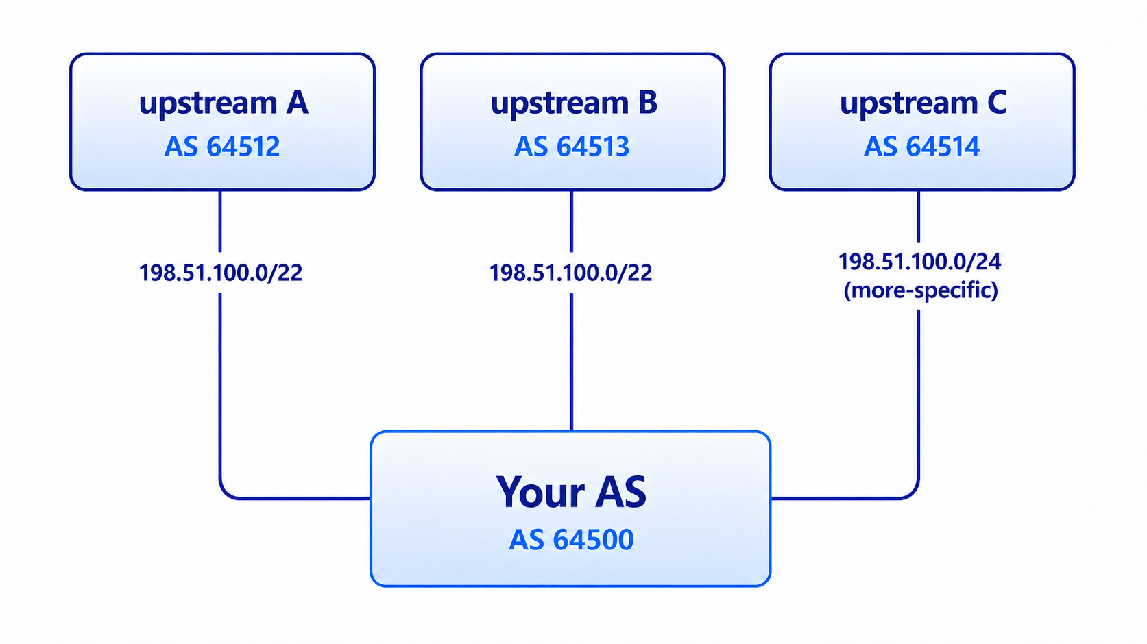
The Reachability Score metric differs from the Visibility Score because it focuses only on more-specific prefixes, which are more likely to carry traffic. In many networks, a less-specific prefix is announced to upstreams, while more-specific prefixes are announced through other upstreams, or through only some of the same upstreams, for traffic engineering purposes.
The Reachability Score is calculated with the same path-percentage methodology as the Visibility Score, but considers only the most specific prefix in any overlap. This score should not be interpreted as a direct representation of actual traffic flow.
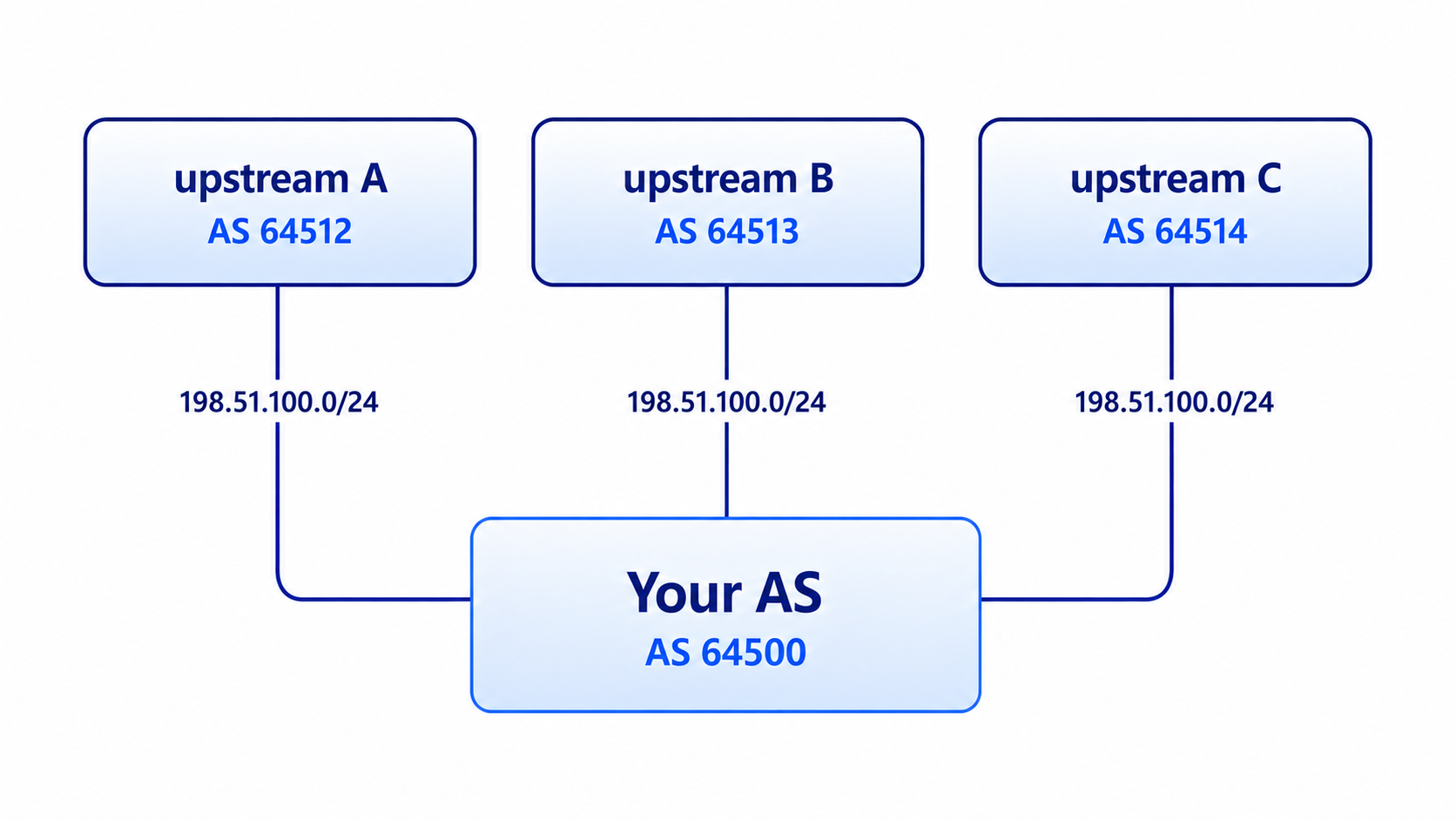
AS64500 announces a /22 prefix and a more-specific /24 prefix simultaneously through different upstream providers. The Reachability score is calculated using only the more-specific prefix.
Example scenario: In the scenario depicted by the image above, the Reachability Score considers only the more-specific prefix 198.51.100.0/24 and not the less-specific /22, since both exist, even if the overlap is partial. In this example, the more-specific is announced only via upstream C, so the Reachability score for C would be 100% and 0% for A and B. The same would apply if both the /22 and /24 prefixes were announced to C.
In the previous example, if the visibility of 198.51.100.0/24 were to be lost, C’s Reachability Score would drop, while the Reachability Scores of A and B would increase. This is because the /22 would then be considered in the calculation, since it would no longer be excluded by the more-specific /24.
Prefixes Percentage
The Prefixes Percentage metric shows the percentage of your total announced prefixes that are observed through each upstream provider. E.g., if you announce 100 unique prefixes in total, 30 are visible through upstream A, 70 through upstream B, and all 100 through upstream C, the Prefixes Percentage metric would be 30% for A, 70% for B, and 100% for C.
When PacketVis detects a significant change in any of the three metrics above, an alert is triggered. Each alert has its own event page, which displays a detailed breakdown of the three metrics before and after the event, making it easy to quantify the impact. The event is automatically resolved once metrics return to normal.
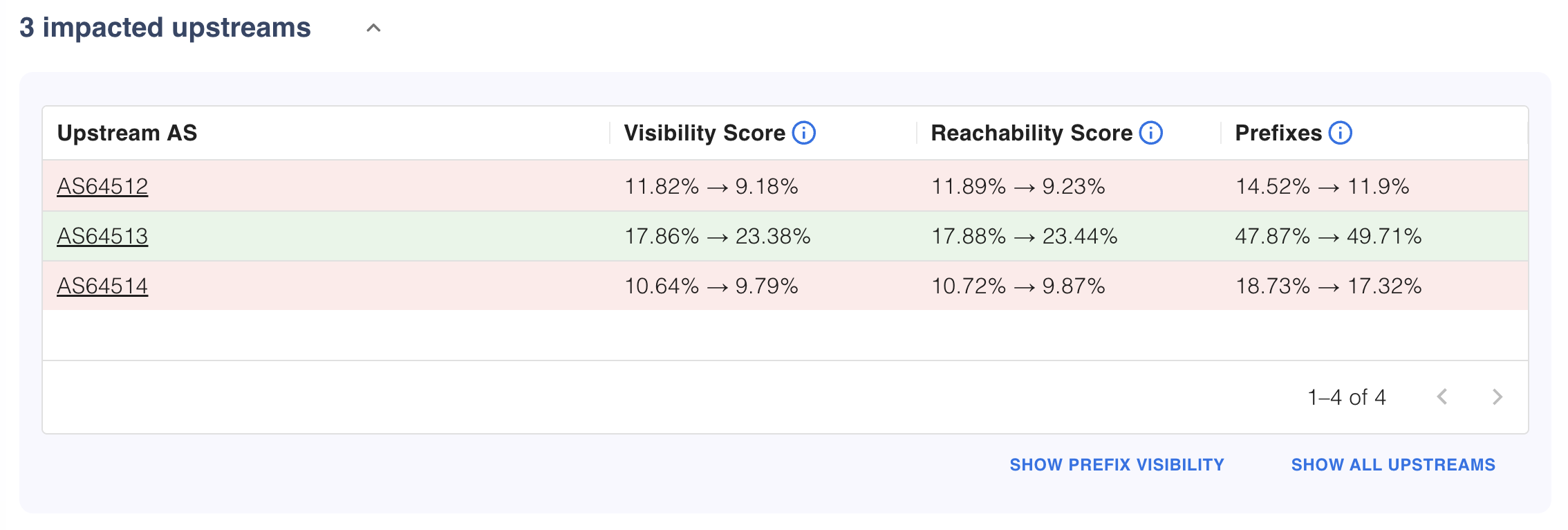
Summary of the three metrics reported in an alert. The arrow separates the values before and after the event.
Visualizing Changes Over Time
The event page includes two interactive visualizations to help you understand the event. Both visualizations update while you have the page open, so you can see how the event evolves over time.
Upstream Graph
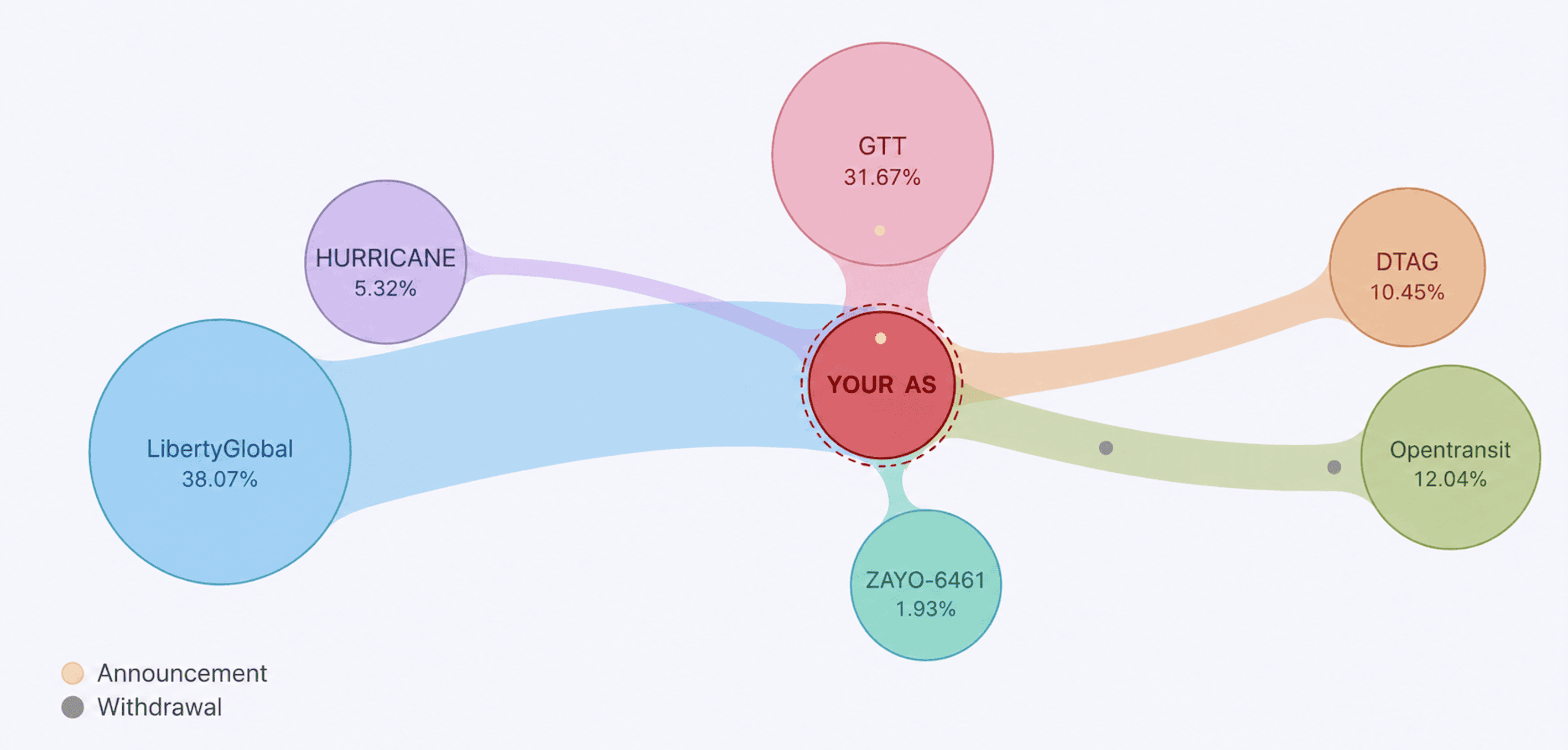
An upstream graph showing the contribution of each upstream to the metric (synthetic data used for illustration).
The upstream graph provides a visual representation of your upstream relationships at any point during the event. Each AS is represented by a node. The node size represents the upstream’s contribution based on the selected metric (Visibility Score, Reachability Score, or Prefixes Percentage), and the value is displayed as a percentage inside the node.
The graph updates as you interact with the stacked area chart below, allowing you to see how the metric evolved during the event. Withdrawals and announcements that cause changes between two timestamps are highlighted with bubbles (gray/yellow) showing the flow of visibility from one upstream to another.
Temporal Evolution
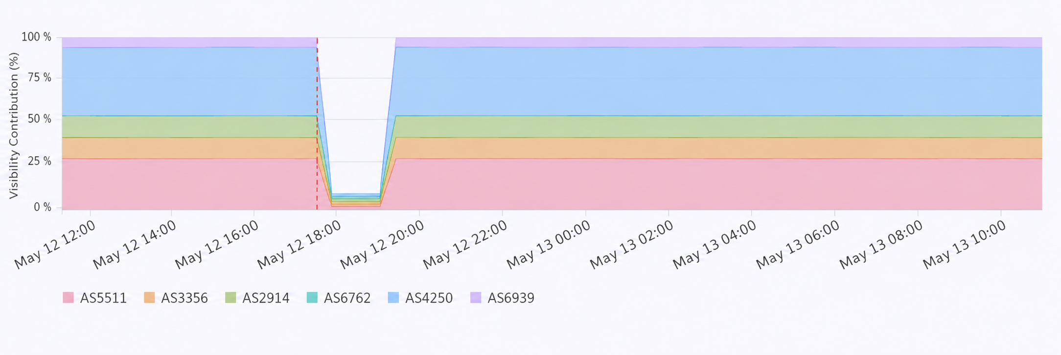
The stacked area chart shows the metric trend (synthetic data used for illustration).
A stacked area chart shows how upstreams’ contributions changed over time. Each upstream is represented by a colored band, matching the colors used in the upstream graph. The red dashed vertical line marks the timestamp when the situation reached the severity threshold that triggered the alert.
For ongoing events, the chart displays a live refreshing indicator while both the stacked area chart and the upstream graph are updated with new data.
Drill-down on prefix visibility
For a more detailed analysis, the “SHOW PREFIX VISIBILITY” button opens a comprehensive table showing exactly how each individual prefix’s visibility changed across upstreams.
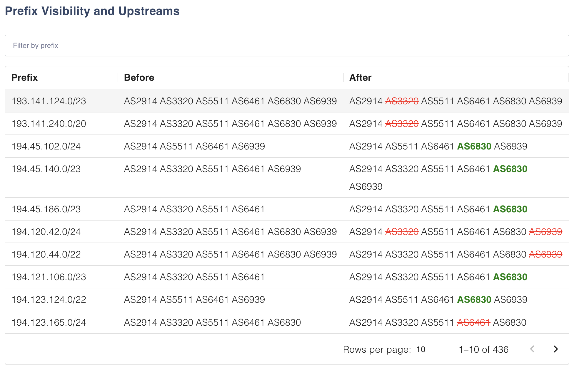
The Prefix Visibility panel allows you to drill down and see the upstream changes impacting a specific prefix (synthetic data used for illustration).
You can search for a specific prefix and see which upstreams were used before and after the event. In the “after” column, in green are the upstreams that started being used for that prefix, while in red are the upstreams that stopped being used. This table helps verify that prefix announcements are visible through the intended upstreams, identify single-homed and multi-homed prefixes, and confirm that upstream migrations completed successfully.
Ready to try it? Enable “Upstreams” monitoring in your BGP monitoring features and let PacketVis start tracking your upstream visibility!